Last year I wrote about the differences between Qlikview and Tableau. Since then Qlik Sense has gotten more popular. Hence, I came up with the idea to compare Tableau 10.0.1 to Qlik Sense. 3.0 SR when it comes to plotting geocodes on a map.
To get some experience in Qlik Sense I started building small applications with Qlik Sence. Personally I am interested in which self-service data visualization tool (Qlik Sense or Tableau) is the best in a specific situation.
What do you need? A dataset with all European postal codes and cities. I downloaded these files here:
http://www.clearlyandsimply.com/clearly_and_simply/2010/10/geocoding-databases-for-europe.html
TABLEAU
Loading the data..
After opening Tableau connect to a Text file by clicking on ‘Text file’ and open one of the following downloaded files CSV-files:
European_cities_us_standard.csv
European_postcodes_us_standard.csv
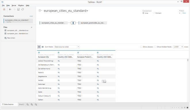
To select only the postal codes and cities in The Netherlands, click on ‘filter’ in the upper right corner and select the field ‘Country (ISO 3166-2)’ and select the country code ‘NL’. Press the ‘Ok’ button twice.
Build the following screen by dragging the other CSV-file to the upper part of the screen. Note that Tableau makes the join between the two tables.
Hide the columns longitude and latitude by right click on the columns. Tableau don’t need these information. It has his own geo-information.
Click on ‘Sheet 1’ in the lower left corner of the screen to go to the next step.
Building the graph in Tableau: Plotting Dutch cities on a map.
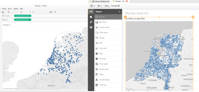
After open the screen, double clicking on ‘European city’ is enough to position longitude and latitude automatically. The map with dots will emerge instantly. See the result below.
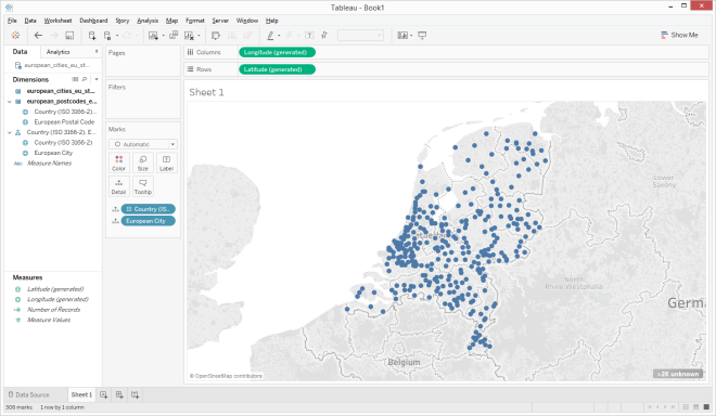
Note (<2K unknown) that not all cities are plot on the map because of not all the (very small) cities are recognized by Tableau or spelled correctly in the dataset.
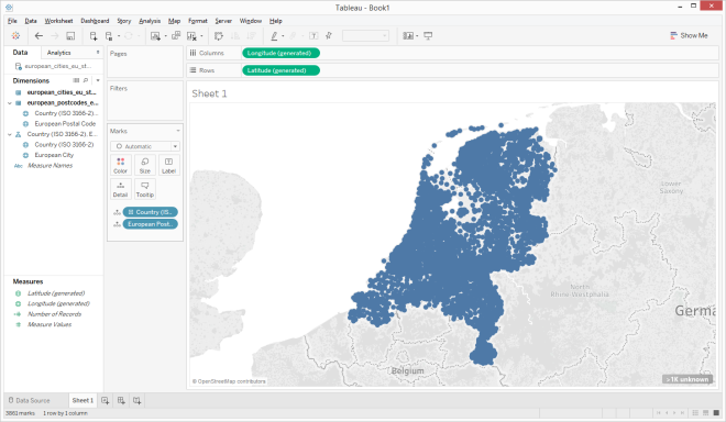
Plotting all postal codes on a map (more detail)
In this section I will plot all Dutch postal codes on the map of The Netherlands. You can do this by replacing the field ‘European city’ on the marks pane by the field ‘European Postal Code’. The easiest way to do this is by dragging the field ’European Postal Code’ on to the field ‘European city’ in the marks pane. See the result below and look how much detail you can get.
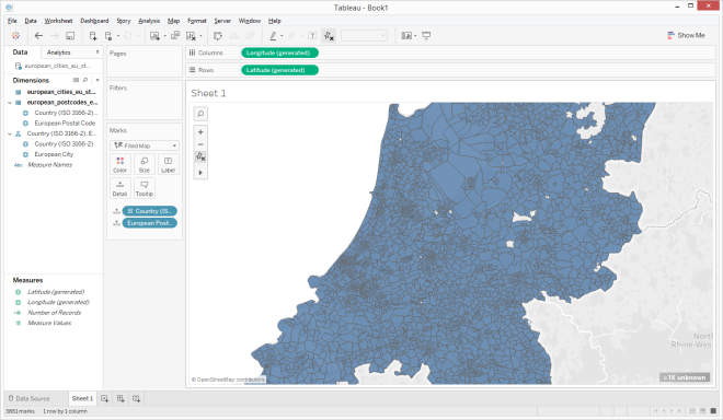
It’s also possible to plot the postal codes area’s on the map. This can be done by selecting the ‘filled map’ in the ‘Show me’ pane.
Qlik Sense
Loading the data..
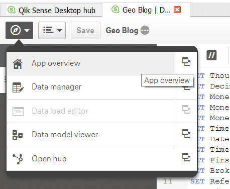
After starting the Qlik Sense application and creating and opening an app, click on ‘Data load editor’. The following screen will appear.
- Create a new connection by clicking the button ‘Create new connection’ in the upper right corner and select ‘folder’.
- Go to the folder which contains the following downloaded CSV-files:
- European_cities_us_standard.csv
- European_postcodes_us_standard.csv
- Name the connection ‘GEOData’ and press the ‘create’ button.
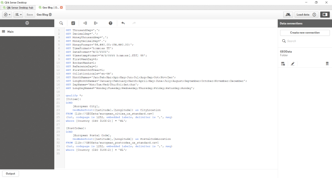
- Copy the following script into the ‘Data load editor’:
qualify *;

[Cities]:
LOAD
               [European City],
               GeoMakePoint([Latitude],[Longitude]) as CityLocation
FROM [lib://GEOData/european_cities_us_standard.csv]
(txt, codepage is 1252, embedded labels, delimiter is ',', msq)
where [Country (ISO 3166-2)] = 'NL';

[PostCodes]:
LOAD
    [European Postal Code],
    GeoMakePoint([Latitude],[Longitude]) as PostalCodeLocation
FROM [lib://GEOData/european_postcodes_us_standard.csv]
(txt, codepage is 1252, embedded labels, delimiter is ',', msq)
where [Country (ISO 3166-2)] = 'NL';
- Click the button ‘Load data’ in the upper right corner of the screen to load data into Qlik Sense.
- When the data has loaded you can make a visualisation. First you go to ‘App overview’ and create a new sheet.
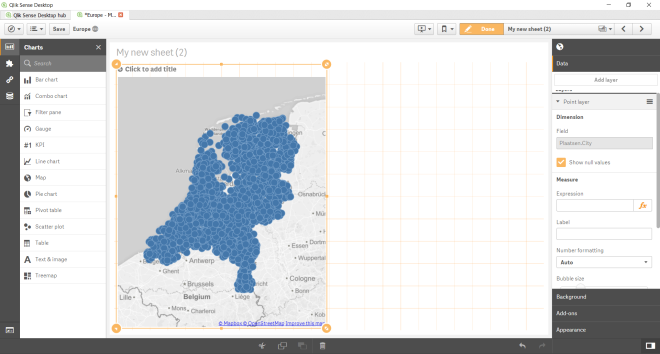
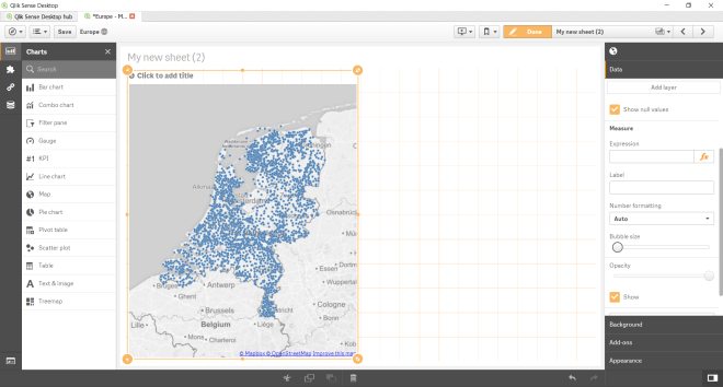
Building the graph in Qlik Sense: Plotting Dutch cities on a map.
1) After creating a new app and importing a record with Dutch cities in it, you can make the graph. Do not forget to put the application in edit mode by using the ‘Edit’ button.

2) Drag the graph ‘Map’ from the chart pane to the sheet. Do not forget to unfold the chart pane by clicking this button

3) Click the ‘Add dimension’ button and select ‘Cities.European City’. The following graph will appear:
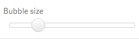
4) If you want, you can change the bubble size:
The graph will be shown as below:
Plotting all postal codes on a map (more detail)
1) Create a second graph by dragging the chart ‘Map’ onto the sheet.
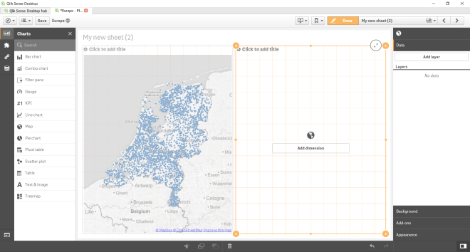
2) Click ‘Add dimension’, select ‘PostCodes.European Postal Code’ and change the bubble size.
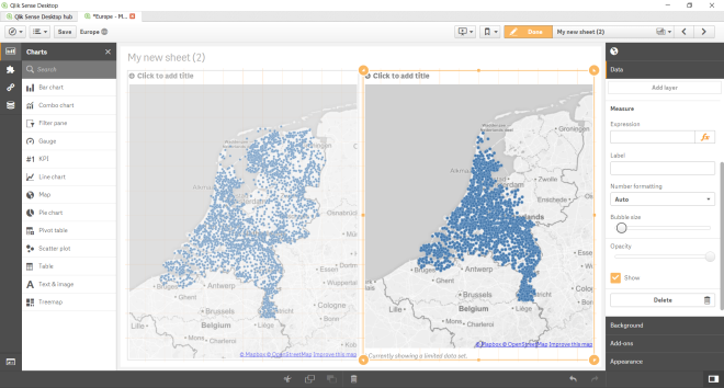
Note: You can see Qlik Sense can’t plot all the postal codes!
CONCLUSION
In both applications it’s possible to make great visualisations. The difference between the applications is that Tableau has geo-coordinates (longitude and latitude) in it for each city in the Netherlands. In Qlik Sense you need to find these data on the internet or buy these data separately. In Qlik Sense you also need some scripting/programming skills to build the application.
Personally I find It’s easier to use Tableau when it comes to plotting geocodes on a map. You need less clicks to achieve results and the user interface is easier to understand.
The most striking difference between Tableau and Qlik sense is that Tableau can plot more data points on a map then Qlik Sense. Qlik Sense cannot plot al Dutch postal codes on a map, whereas Tableau can plot all European postal codes onto the map.
As both Tableau and Qlik Sense are complex applications, I might have overlooked some features that would make this easier in either Tableau or Qlik Sense. As I am still learning I would appreciate it if you leave a comment with your suggestions or best practices for either applications.